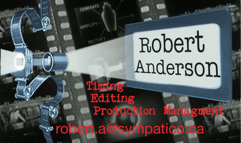
With the Animation festival coming up I thought it would be a good time to update my business card. I'm also knee deep in a demo reel. I don't have much to put in it but it sure is fun doing it!
Comments are welcome. I'm not sold on the red as of yet.
6 comments:
Hi Rob,
Like the business card, I also like the red letters as it stands out! Good luck at the festival!!
Thanks Sis!
I noticed that I spelled management wrong so that I shall fix..... The red is growing on me. I think I'll add some white highlights.
I like the red too, although I found it a little hard to read your email address. I think adding the white highlights will help though. Yes I noticed the spelling error but since you caught it I can't say anything.
Looks good. Just one thing I would do is alter the grey film strips, if they are seperate from the camera and screen images. If they are, I would increase the transerancy a bit so that it looks different from the screen and camera. You've done a good job in the newer versions seperating the text from the rest of it, so what I'm suggesting is the film strips would look like the background, the film camera and screen would be the midground, and the test the foreground. If you could get that to work you would go from a good card to a kick ass one.
I love the overall design of the card Rob; awesome :-) I think all the suggestions pretty much say what I would offer, so, "go to"! Eager to see the final product :-D
thanks for the comments all. Very good input. I should have a new version up tonight!
Post a Comment